LegalAtoms
Help users prepare a fully completed legal documents and file with courts.
Overview
LegalAtoms
LegalAtoms is an online e-Filing application that support users to prepare and file their legal case with minimal fees. Snohomish County Superiors Court and Okanogan county have made LegalAtoms the official software provider for all civil protection orders.
opportunities
Incomplete filing errors & expanding business model
Initially launched in 2019, LegalAtoms streamlined self-prepare court documents for divorce or domestic violence and operated only in Washington state. With 2 years development, LegalAtoms expanded its business modal to support more legal cases fillings and being authorized to practice in more states.
To eliminate the uncompleted filing errors and enhance user satisfaction with the filing experience, the product team plans to optimize the e-filling user experience and add new features to support the growth of business.
outcomes
Filing errors were reduce by approximate 40% in the first 3 month of the new version launched
I collaborated with PM & Dev to envision a product strategy and drove the new vision to launch. I also filed patents for the new and innovative UI, crafted a design system that speeded up the process of development.
Empathize
The goal of the research is to uncover the usability issues, understand user’s expectation while filing a case online.
The research questions guiding the study were:
- How easy is it for users to filling the forms on line?
- How satisfied are the users with the entire e-filing experience?
- Are users able to adequately understand the messaging through the filing procedure?
Understand the Product
Current App Evaluation
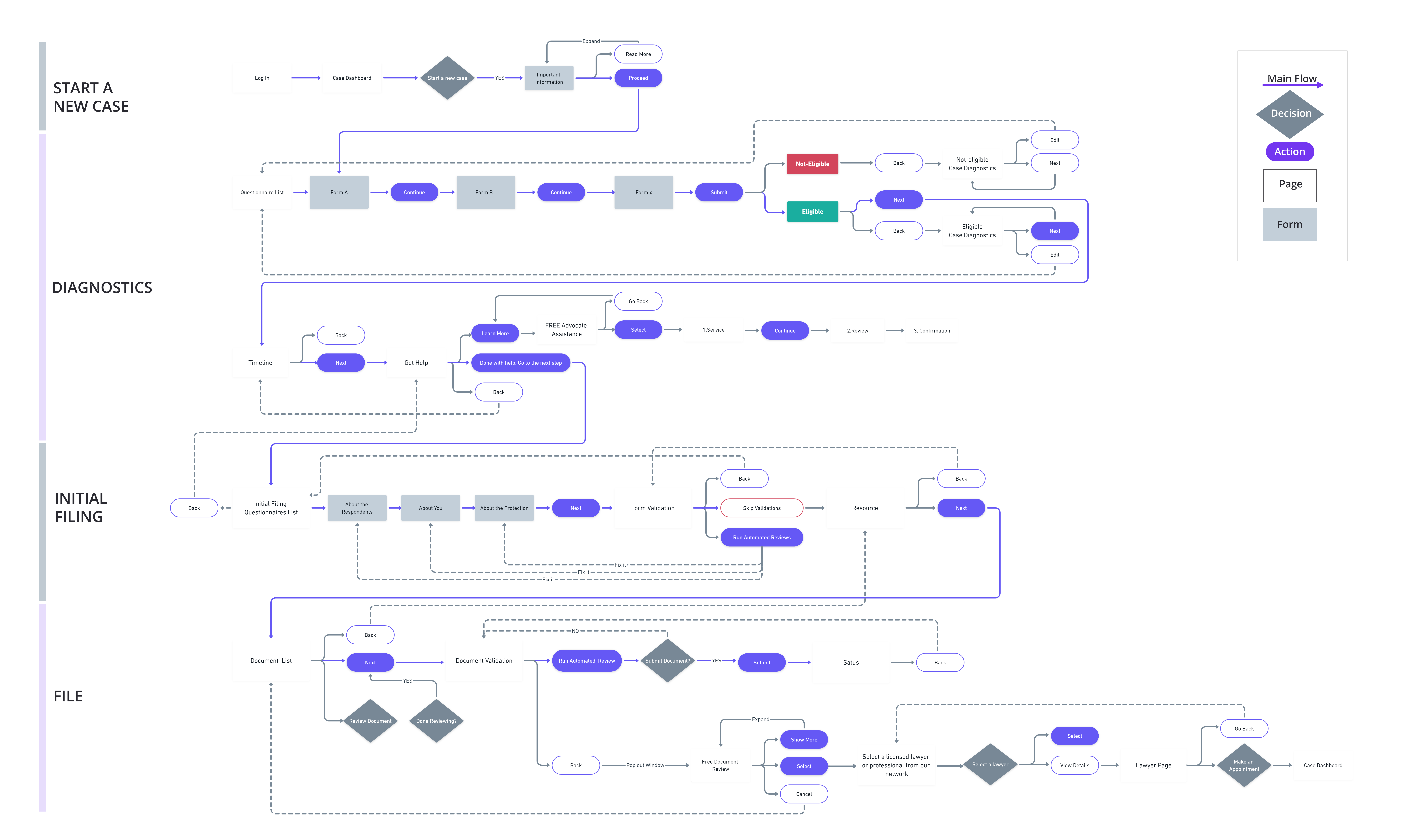
Before burying my head into the design work, I wanted to understand previous design stories behind the scene. I conducted a heuristic evaluation to find the usability problems in the existing user interface design. Then I created a user flow diagram to map out each and every step the user takes—from entry point right through to the final interaction.
Key Findings
- Legal consultant service is integrated with the filling flow, users can’t come back to the current status if they deviate to the service flow.
- The error messages lack of visible indication of what went wrong.
- The initial filing questionnaire process is tedious, questions were showed in separated signal pages, users have to click continue button every time to go to the next question.
Understand the People
User Flow
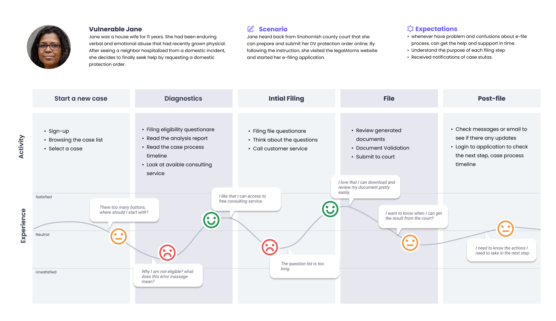
I interviewed 4 current users and 4 potential new users to find out how they experience with the Legal Atoms Web application. Some feedback from participants validated my heuristic evaluation assumption. All findings help me dive deeper into the users’ pain points.
Key Findings
- Legal consultant service is integrated with the filling flow, users can’t come back to the current status if they deviate to the service flow.
- The error messages lack of visible indication of what went wrong.
- The initial filing questionnaire process is tedious, questions were showed in separated signal pages, users have to click continue button every time to go to the next question.
insights
Providing daunting options results in inaction
There are hundreds of places one could start, creating a daunting choice paradox that inevitably results in inaction.
Filing experience can be easily overwhelm
Filing a case is never a fun and easy task. When petitioners file cases online, they were rarely in a peaceful mindset which would cause the filing experience can be easily overwhelming.
No one reads long instructions
Even with extensive written instructions, users are going to complain that the instructions are not clear enough. Why? The truth is this: no one reads long instructions.
Reframing the problem
How might we transforms an overly-complex filing process into a seamless journey?
I broke the problem down into three key objectives and began to work on them in parallel. These "how might we" questions drove our exploration and experimentation for whiteboarding concepts.
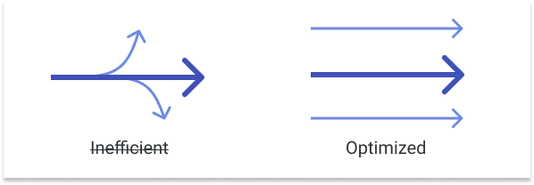
How might we design a more streamlined flow to alleviate confusions placed upon petitioners?
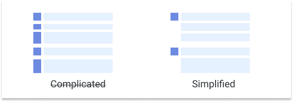
How might we simplify the form filling process that users are more likely to complete with ease?
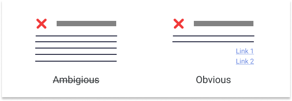
How might we help users recognize, diagnose, and recover from errors?
iterating
Since there were no pre-established patterns from LegalAtoms’s design system, I explored a variety of design treatments to find opportunities to make e-filing user experience more user-friendly.
Exploring design treatments
Streamline the E-file process flow
A major reason incomplete and abandoned filing occurred were because petitioners felt unconfident when encounter archaic legalese thought this overly complex journey. Our data revealed that 90% users knew nothing about the filing process when they first using the application.
I proposed three key ideas to help make the filing flow more user-friendly:
- Focused on one task at a time;
- Show process toward a goal.
Focused on one task at a time
Previously, all the case-related information is placed in dashboard page and the key flows were started from here as well. Considering that LegalAtoms will provide more cases options for e-filing, stocking everything in the some page will make the filing process more complex. In order to simplify the key user flow experience, I broke the process down so each task is separated, so that users are able to start and follow each tasks more efficiently.

Show progress toward a goal
Over-all improving the visibility of status is the key to keep the momentum up by highlighting progress.
The current section of the workflow is underlined in the navigation bar, giving the user a visual indicator of how many more steps there are left in the initial filing process.
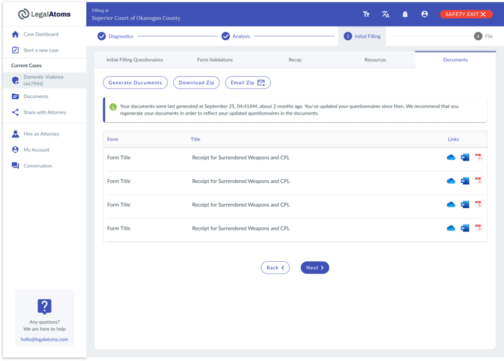
When users are filling their form, the navigation should be more clear and simple. The form is large enough to break into multiple steps, it deserves a separate clearly focused space to work with it. Exposing general navigation or any links that will disrupt the process will just create confusion.
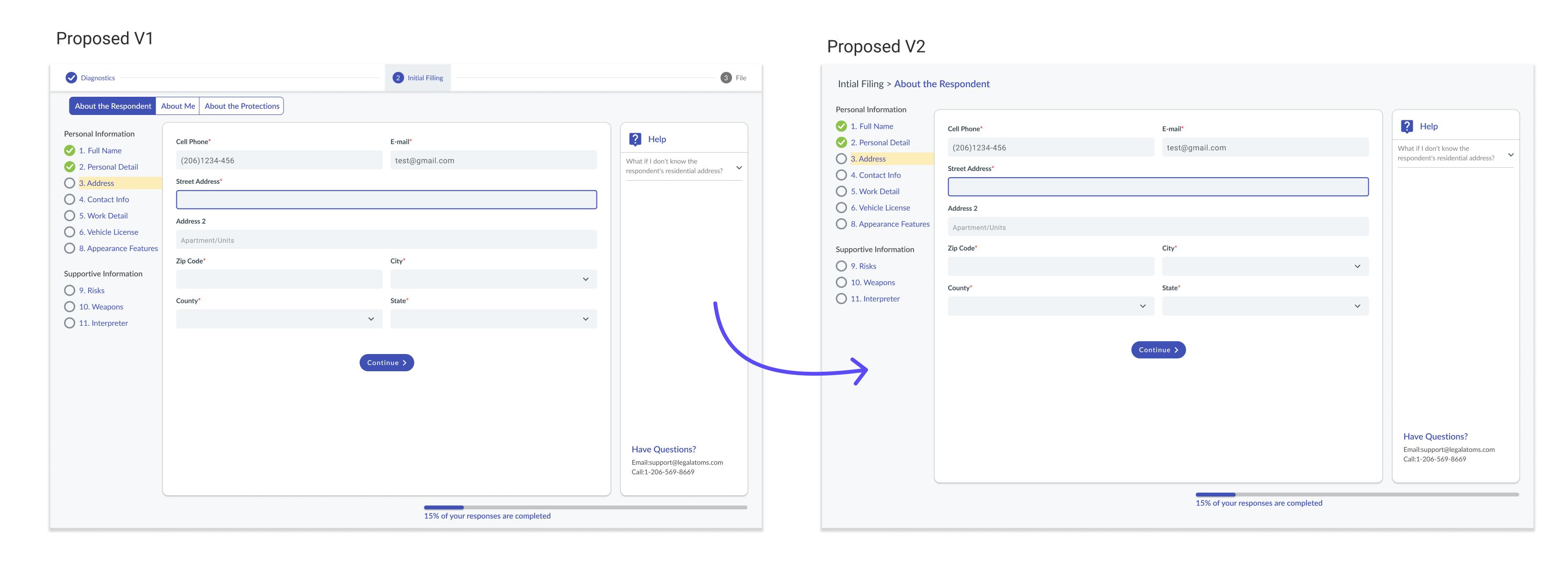
I clarified the current step and the next step to help users set their expectations. This is essential to avoid confusion, frustration, and abandonment.
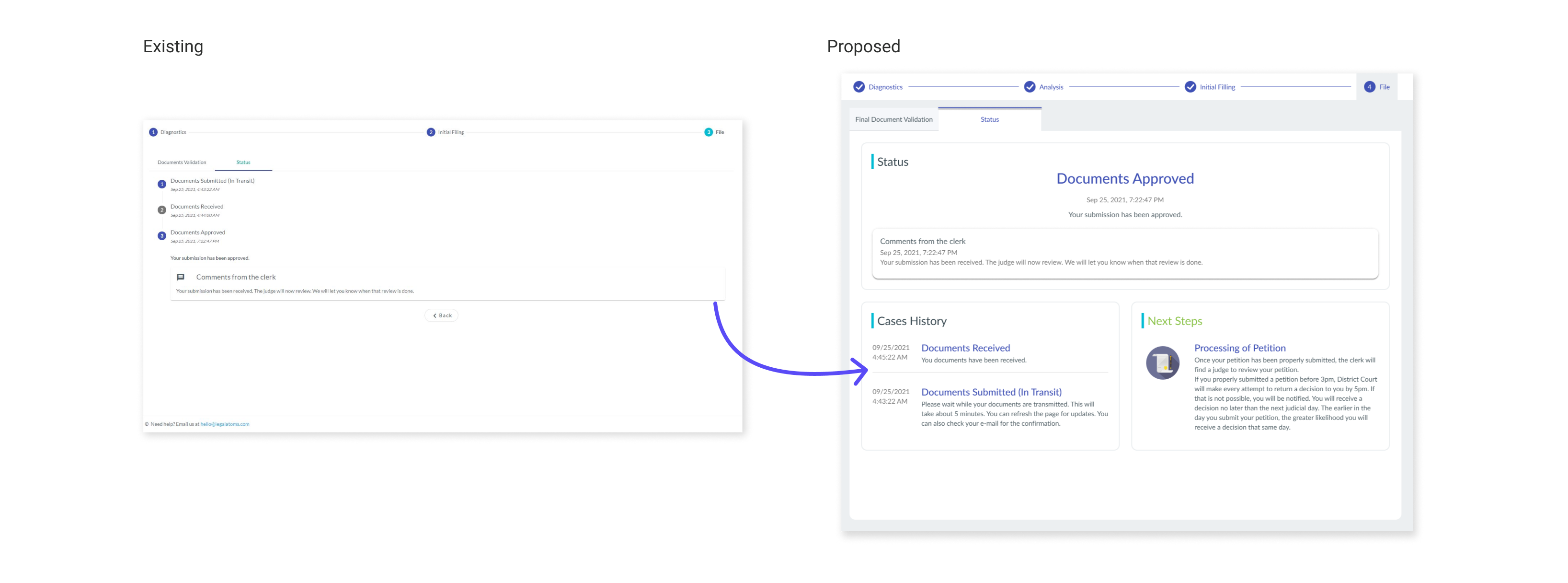
Exploring design treatments
Provide simplicity to form filling
A well-designed form should enable users to complete it efficiently without confusion. My end design goal is to increase efficiency in the form-filling experience and minimize errors.
Break the questionnaire down into manageable steps
If the questions are easy and don’t require a large cognitive load, I grouped them together on one screen; but if a series of questions requires more thought and attention, they are typically presented one at a time.
Support focused on the current task
Aside from the Support Center, there are also relevant links throughout the web app to answer users’ most frequently asked questions. For example, as a user is entering respondent’s address, helpful links such as “what if I don’t know respondent’s address?” is displayed.
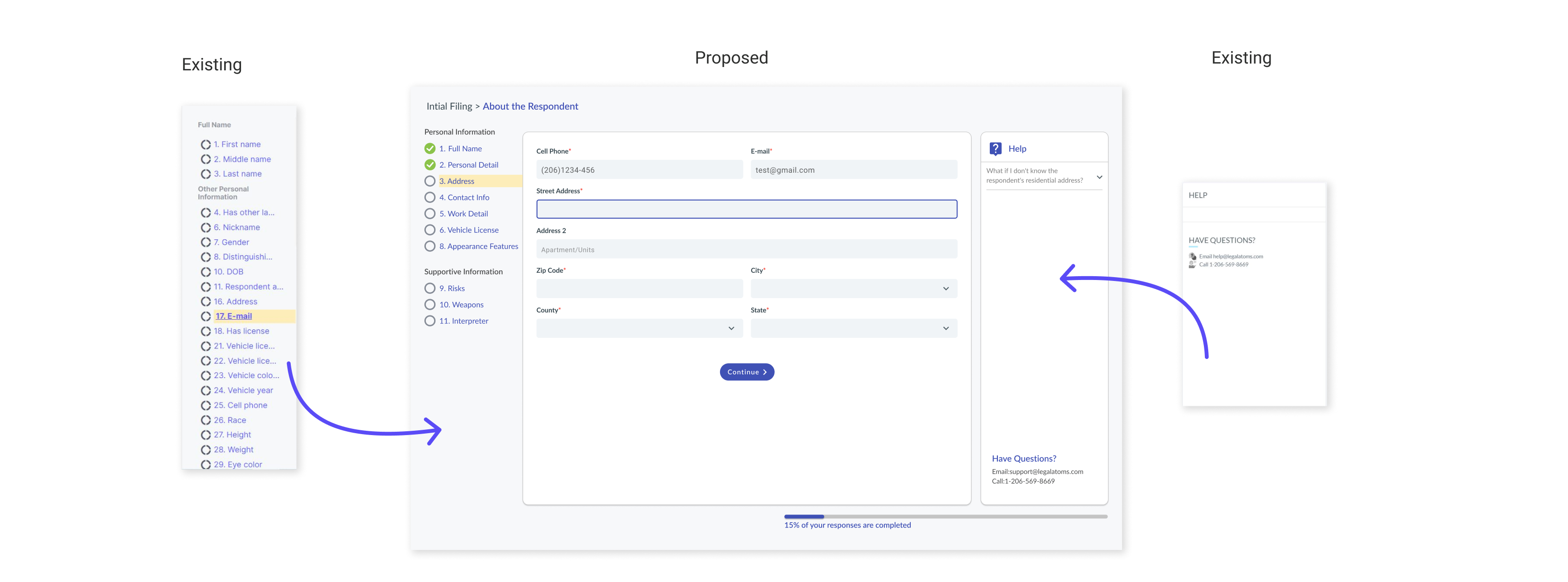
Exploring design treatments
recognize, diagnose, and recover from errors
I tried to craft a redesign that prevents the occurrence of the error in the first place and then created well-designed error messages. Our team recognized Form Validation is a most feasible solution to error prevention.
According to user research, users are very likely skip the long instruction in the error massage which led to frustrating, thus a key improvement here is to remove any visual noise or any confusion.
Validation checkpoints
Filing a case is a long, multi-step process. Consider the user journey as a whole—we can include checkpoints along the way that help ensure the filing process is validated. For example, when user finishes filing their questionnaires, we will ask users to run an automatic validation. If they hit the skip validation button, a warning window will pop out to tell them the application will be rejected for being incomplete.

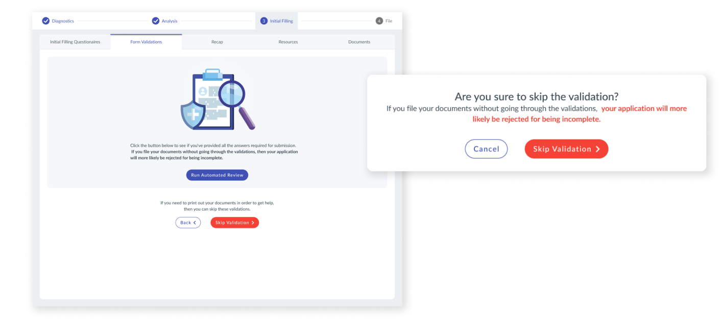
Show a path forward
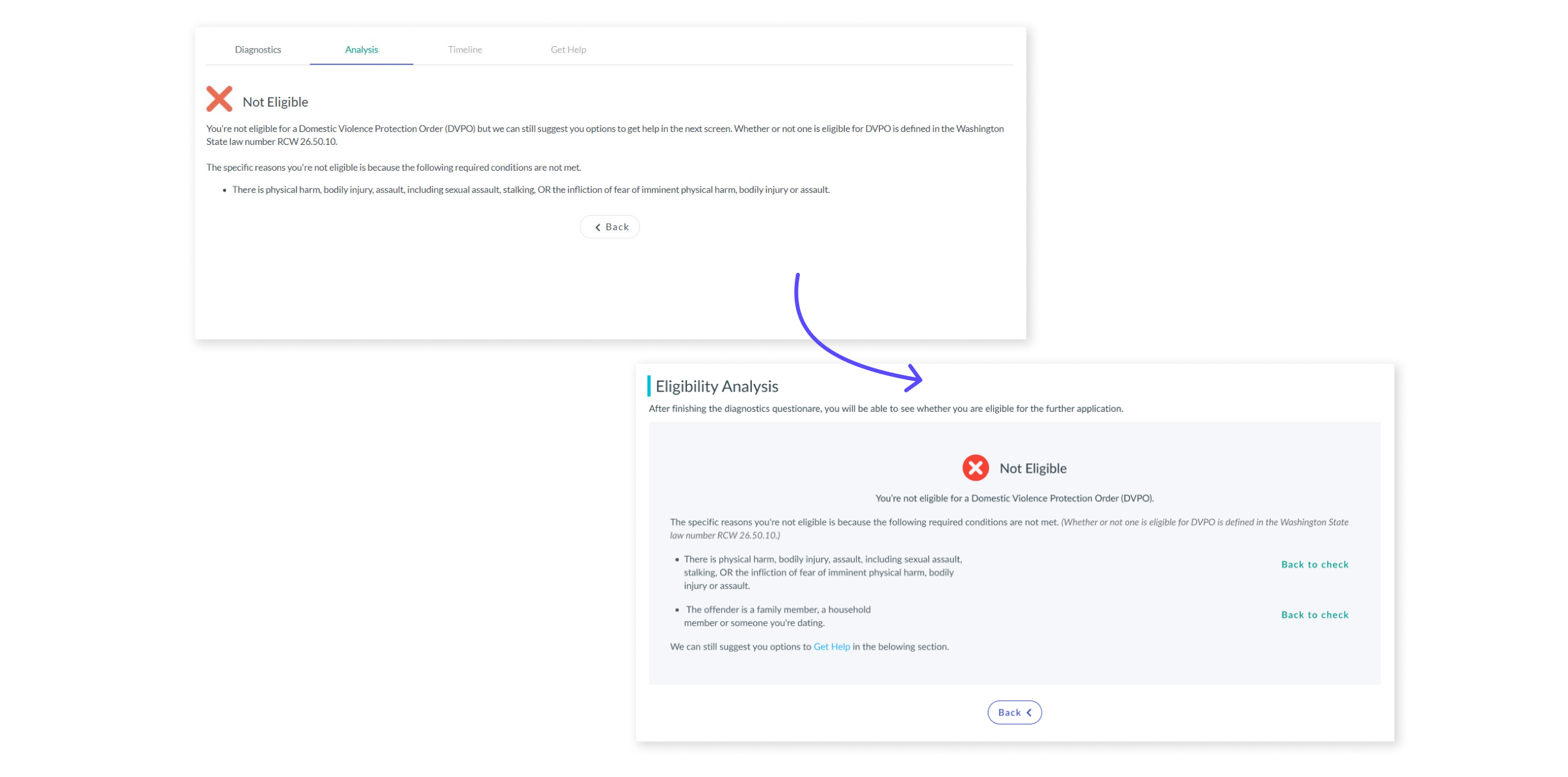
The current message only lists the reasons why the petitioner is not eligible but has no instructions on how to recover.
The error message could be made more specific by telling users how to fix their invalid input, To help petitioners better identify the error, I added a quick link to the exact questions causing the non-eligibility.
