Three Dollar Bill Cinema
Elevating the spectrum of queer stories
Overview
The Client
Three Dollar Bill Cinema is a non-profit organization that fosters deep community building by showcasing and supporting Queer film programming and the engagement of constructive social dialogue through LGBTQ+ education and experiences.
The Mission
To better serve their customers, Three Dollar Bill Cinema is looking to revise the design of its website to increase its user engagement rate, improve the overall user experience for its core users, and bring a fresh and unique look to the organization that still rooted in their values and mission.
Outcome
We pitched the final design to over 8 TDBC stakeholders and got them all to buy-in for future implementation. We also delivered a whole set of design assets that are ready for production.
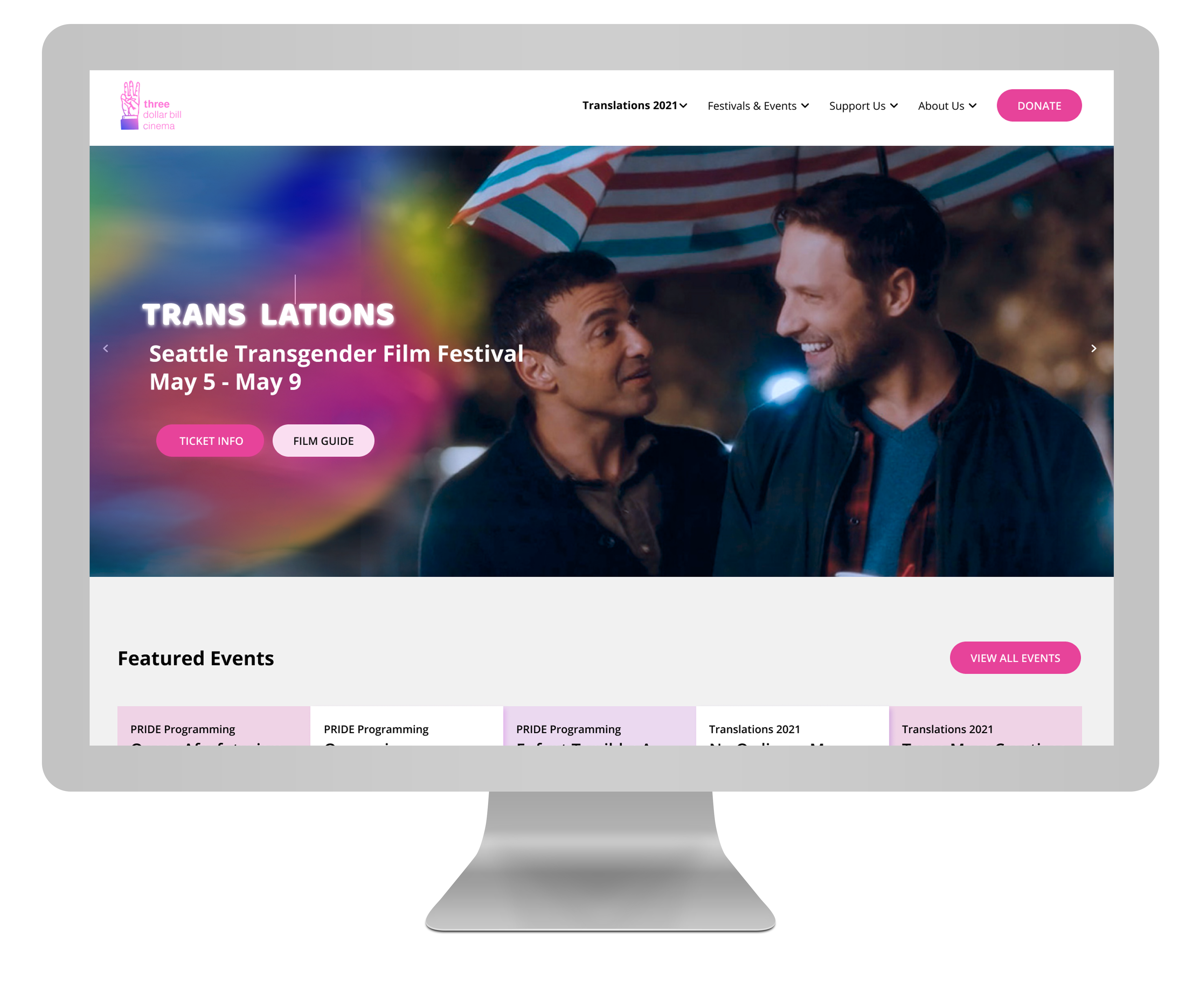
Challenge
To better uncover the usability problems and determine the participant’s satisfaction with the current site, we employed 3 research methods: literature review, surveys, and interviews. The feedback from our participants gave us a more clear design direction.
Identify:
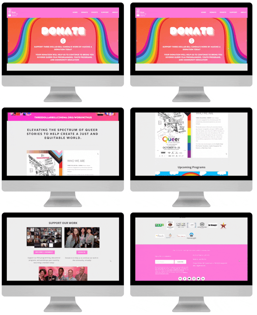
Users were uncertain of the mission, purpose, and events hosted by TDBC
Contents:
Content was not located where users expected and very repetitive
Cohesion:
Visual style and language across website was often inconsistent
How we might help users feel more confident while using the website to find the information and features they need?
Research
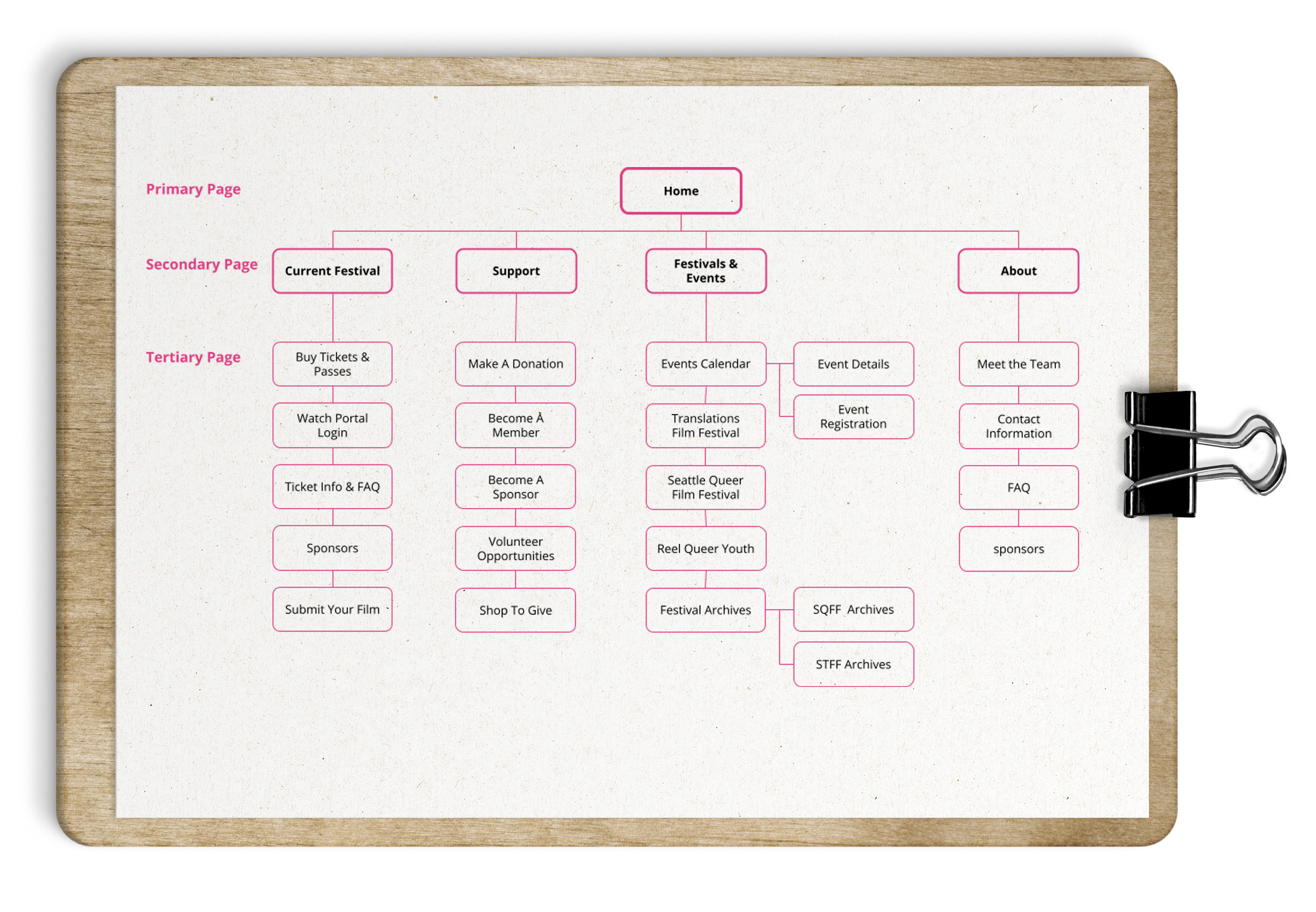
Our work began with developing the strategy and goals of the project. Focusing on three separate user personas—audience, sponsors and volunteers—we created tasks matrix that covered user goals for each. Through conducting a card sorting, we were able to define a new site architecture that’s simple to navigate and goal oriented.
Personas
Festival Audience

NEEDS:
Buy tickets & passes
Find event details
Donate
Become members
Sponsors

NEEDS:
Understand TDBC’s mission
Learn about sponsorship benefits
Contact TDBC representatives
Volunteers

NEEDS:
Find volunteer opportunities
Find event details
Submit a film
Card Sorting
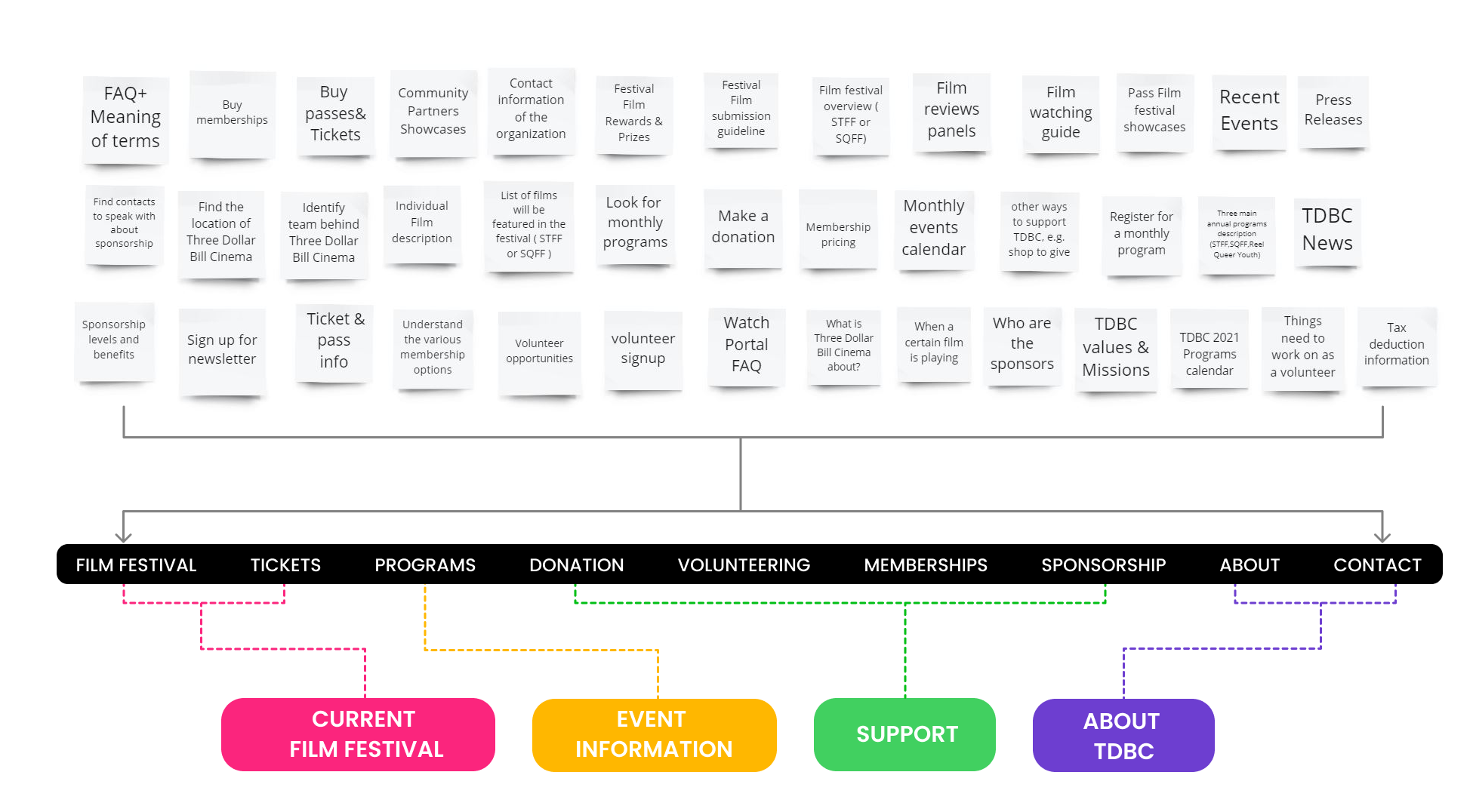
I created 40 cards representing all site pages and major tasks of the respective personas, the following 9 categories was created by our 11 participants. Then we merged them into four main categories.
Site Map
Prototype
We set two main UX goals for the project: make content more enjoyable, and enhance user orientation by applying a clear information hierarchy. The main actions we took include:
- Cut down on misplaced & repetitive content
- Have Informative headers in each level of pages
- Clear paths for personas to complete tasks
- Make sure appropriate information is always accessible
Wireframe
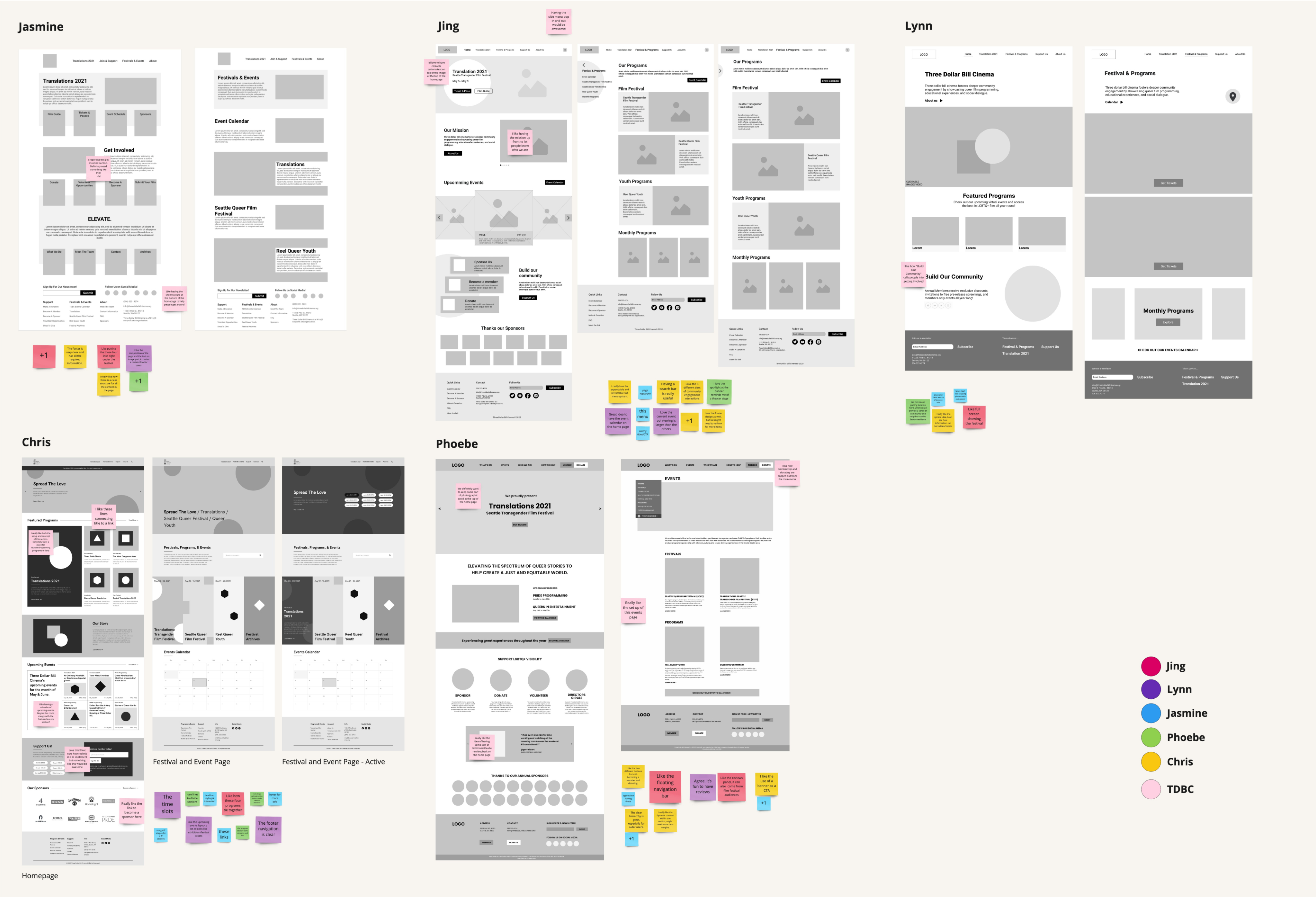
Based on the the information architecture, we started to explore design opportunities by sketching and making low-fi wireframes of the homepage and a secondary page.
Takeaways:
The following elements were well received from our clients:
Navigation:
Having the membership and donation buttons popped out from the main menu
Having the side menu pop in and out. Having the footer navigation at the bottom.
Content:
Flexible layouts for “About us” and “Support Us” sections in the home page keep the site fun and welcoming.
Having some sort of testimonial/audience feedback on the homepage
Interaction:
Loved to have clickable buttons/text in the hero section at the top of the homepage
Clickable prototype
We then created a clickable prototype and conducted a usability testing with four participants.
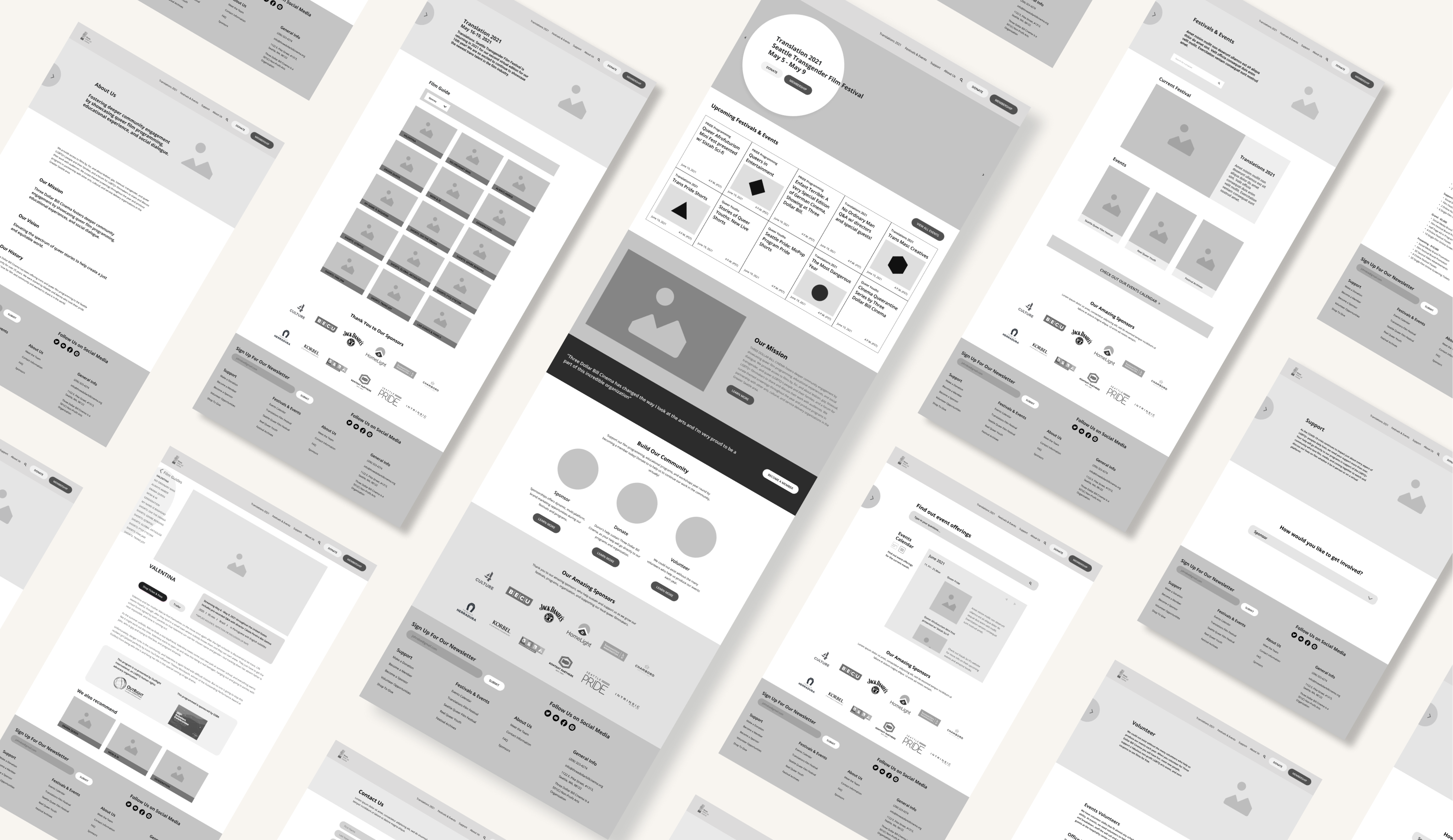
Highlighted issues:
- The side menu with a hovering interaction is not intuitive: users find it unclear or don’t use it at all.
- “Submit-film” link needs to be more visible.
- The “support us” landing page looks empty.
- Contact info on “Sponsorship” page is hard to find since the text is too small to read. They prefer having a hyperlink or button to send emails directly.
Modifications
- Remove the pop-out side menu. Combine the secondary navigation with the main navigation menu in the header which users are more used to
- Replace the hyper link with a “call to action button” and place it in where users can easily find.
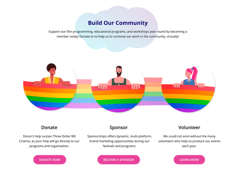
- Add brief overview for each “support” category in the “support us” landing page.
- Place the relative contact information in the full width banner with a CTA button.
Final Design
To establish a strong brand identity of Three Dollar Bill Cinema, we discussed with clients to come up with the brand tenet: Unique, Bright, Fun, Queer and professional.
unique
Showcase the freedom to explore and be different.
Bright
The visual color tone should be bright and vibrant
Fun
Being an engaging and holistic organization
Queer
We are out of the box
Help people take their barriers down
Professiona
Proper information hierarchy.
Clear and coherent mission and goals.
Visual Identity
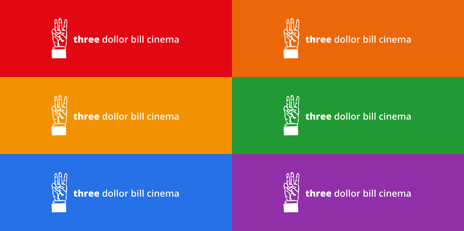
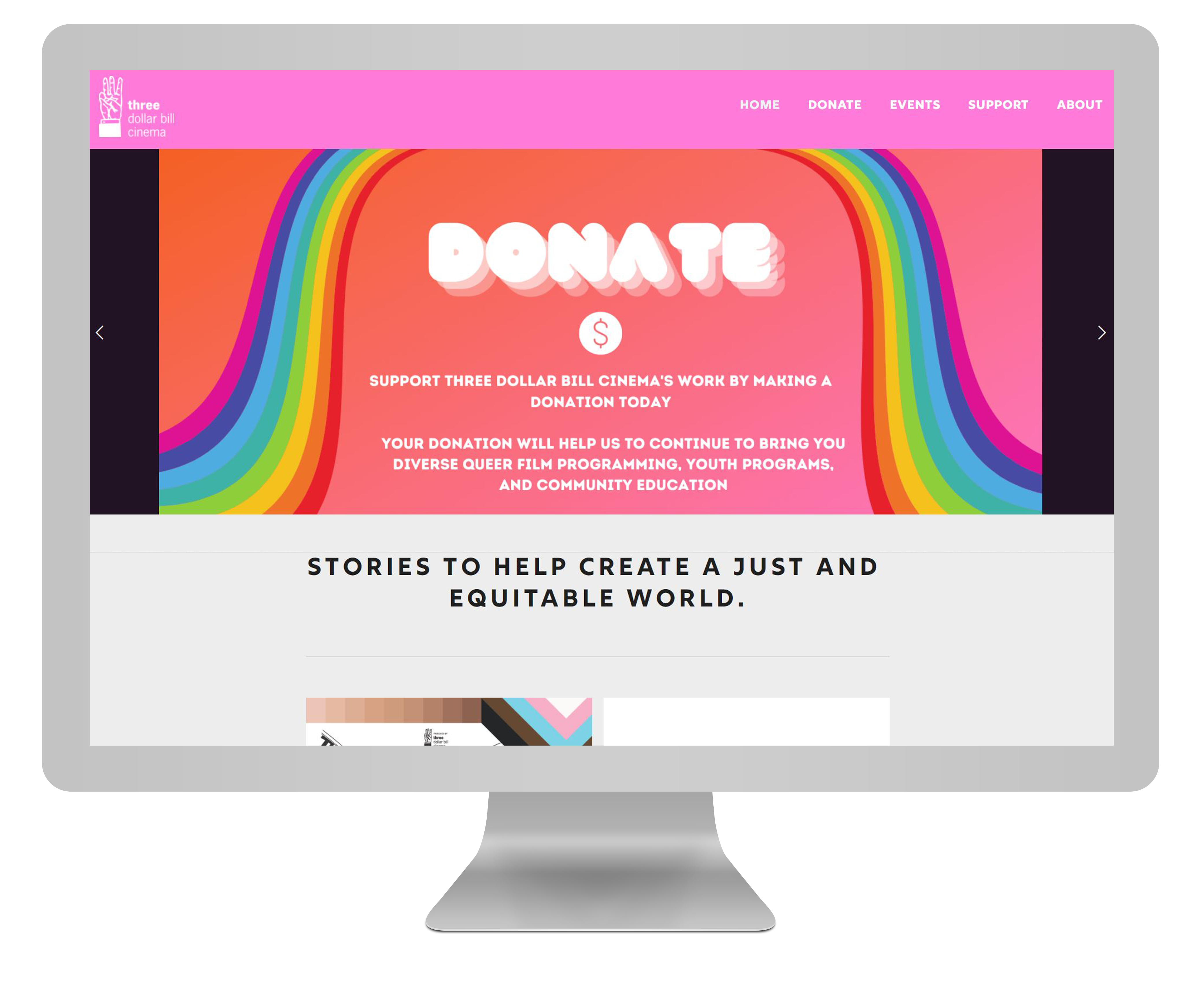
I adjusted the original pink be more neutral and used it as a primary color in where we want to grab users’ attention. Combined with other gradient colors, the overall bright tone can bring energy to the site.
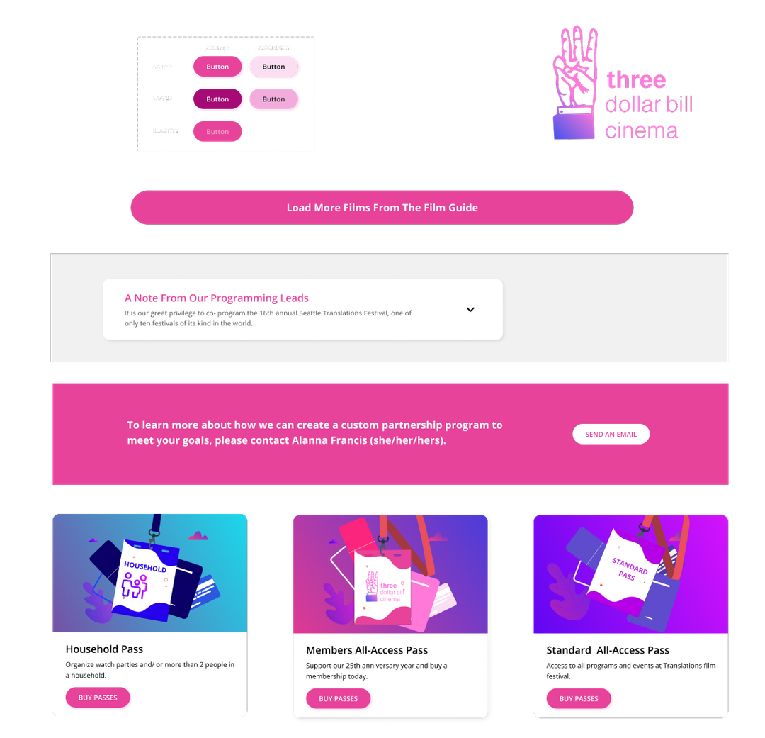
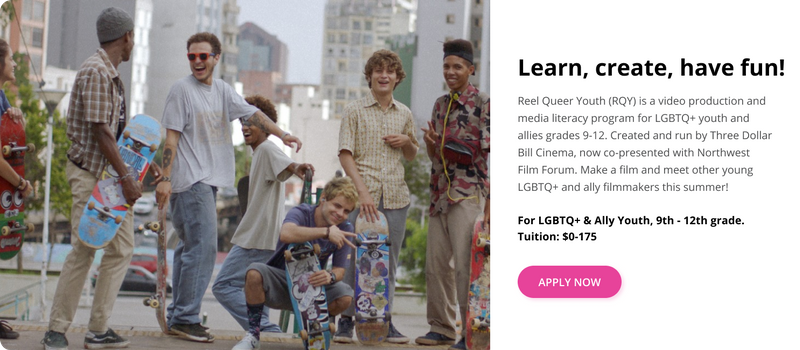
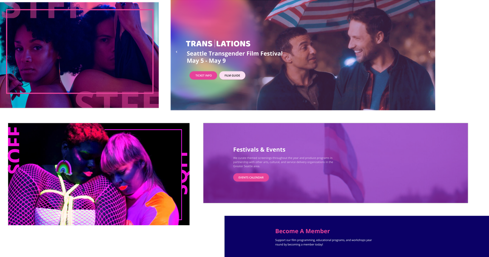
We used a mixture of illustrations and photos to showcase the uniqueness of Three Dollar Bill Cinema. Right now they lack the resources needed to make many illustrations, therefore I took advantage of their existing film photos by re-editing them to generate explanatory graphics and informative header sections for our primary, secondary and tertiary pages.
We then created a clickable prototype and conducted a usability testing with four participants.
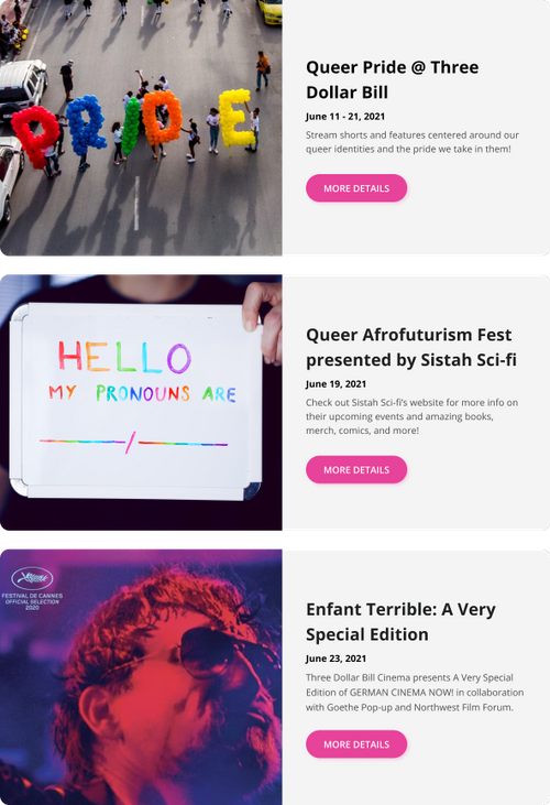
A grid of card layout
We replaced the original walls of text by introducing a grid of cards layout, resulting in a more natural viewing experience for users. Bite-sized previews help visitors find the content they like and dive into details by clicking the card.

